Cross-functional R&D team | 1 month @ 10% | athenahealth | 2015
PROJECT OVERVIEW
I served as a UX advisor and designer on a quick sprint to create a new ICD-10 lookup tool for Epocrates, the leading mobile tool for physicians.
ICD-10 BACKGROUND
ICD-10 is a system of billing codes tied to the diagnosis of a patient. The architecture of the billing system was overhauled in 2015, and after several delays, healthcare providers were going to need to switch over to using these new codes instead of using the old system of codes, ICD-9. Epocrates had a legacy tool for looking up ICD-9 codes, but because there would be a window of time wherein providers needed to reference booth ICD-10 codes and ICD-9 codes, we needed to build a new ICD-10 tool rather than simply swap out the data. The ICD-10 coding structure was also very different than the ICD-9 structure, and 10 times as many different codes are available in ICD-10, with no clear mapping between the old and new codes.
RESPONSIBILITIES
- Create wireframes, interaction demos, and specs
- Work with developers to address edge cases
- Perform edits and visual QA on the fly alongside developers
CHALLENGES
- Create display rules and constraints with challenging and immovable content (titles with dozens of words, where abbreviating wasn't possible, decision trees with varying levels of depth etc)
- Resolve usability challenges from the previous ICD-9 version tool without requiring users to completely re-orient their mental and navigation models when switching over to use the ICD-10 tool
- Technical debt and working within a multiuse app created additional constraints and hurdles
- Very limited developer time
RESULTS: INTERACTION IMPROVEMENTS
BROWSE SEQUENCE
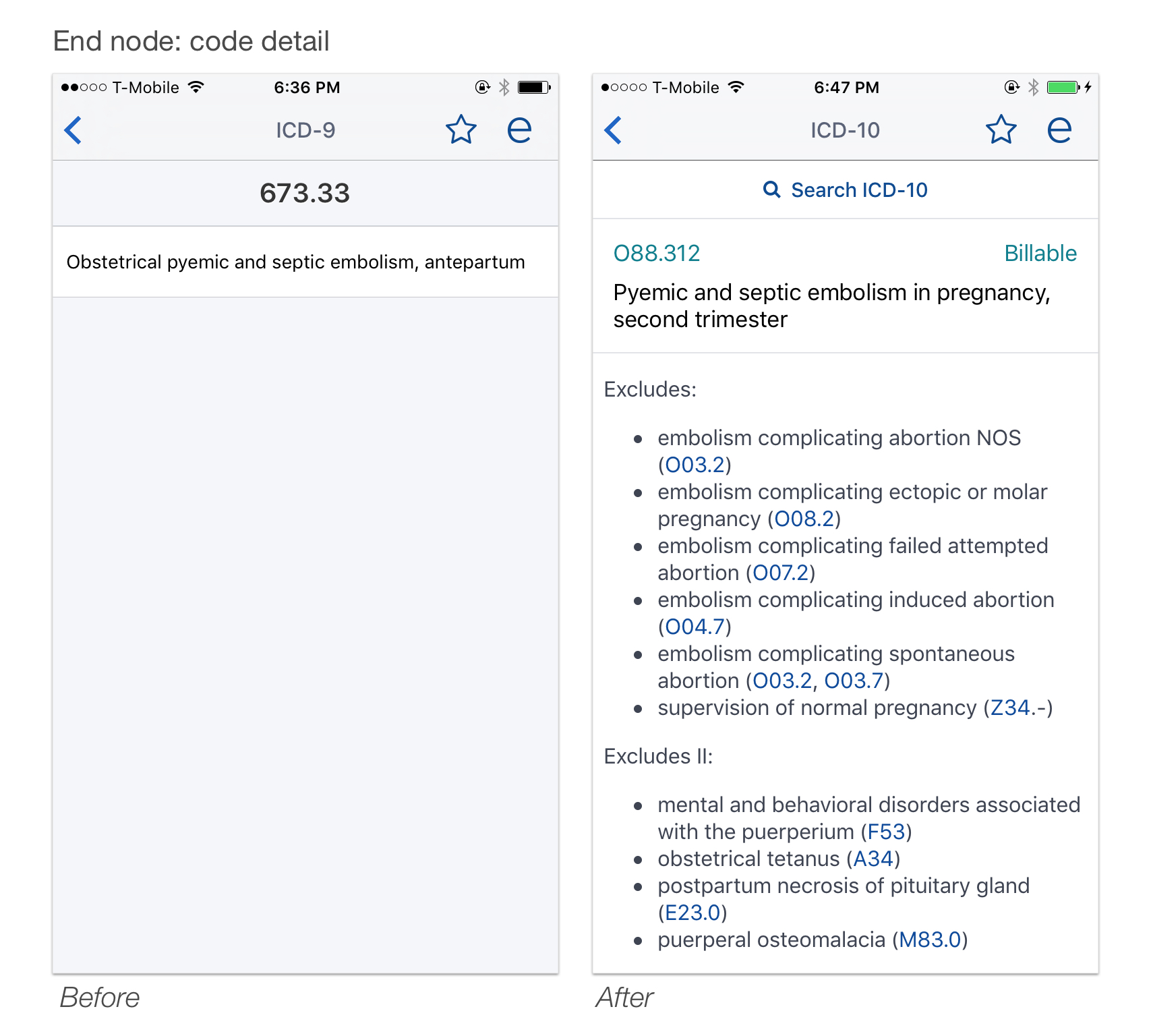
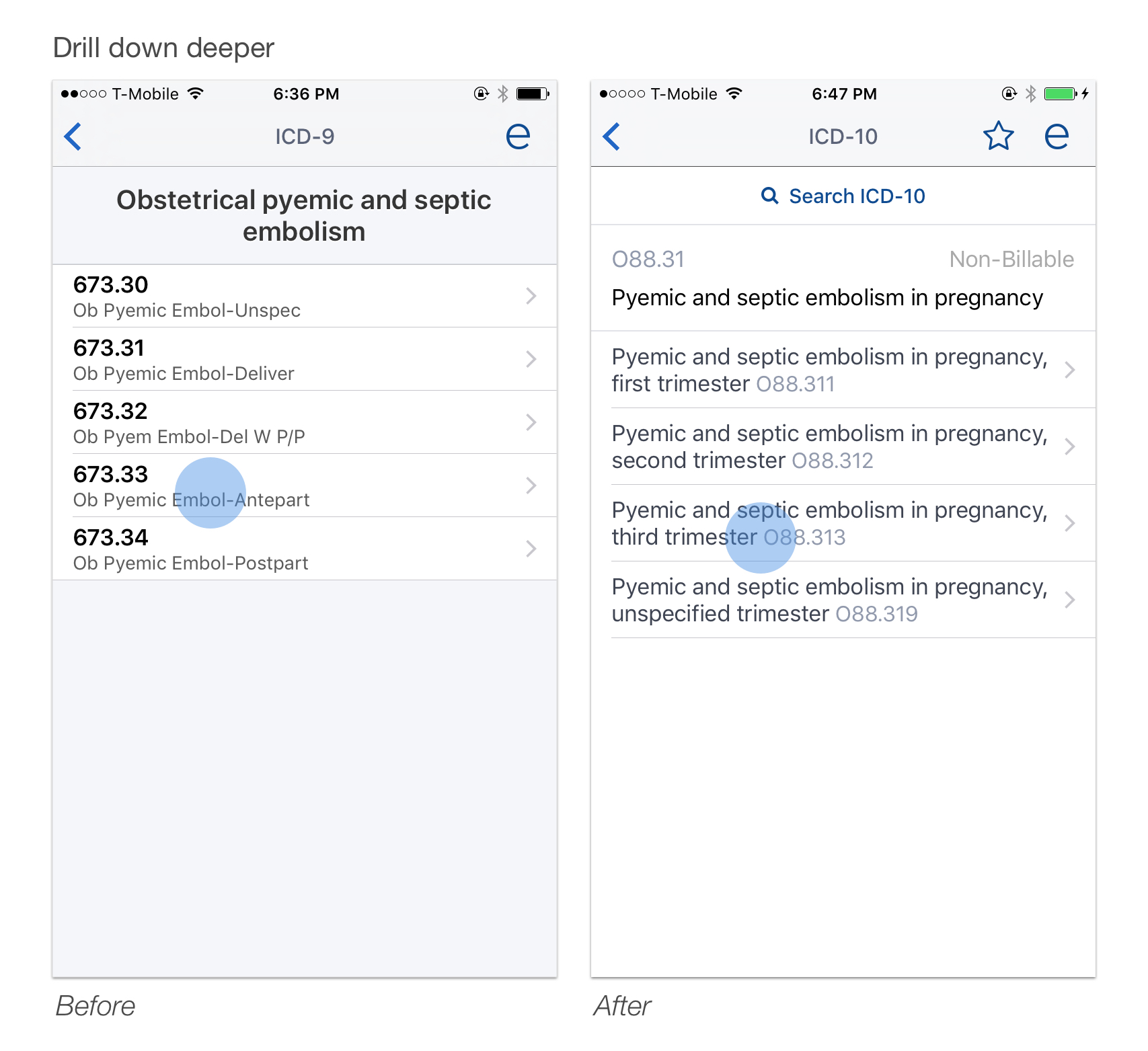
Clear indication you’ve reached a billable code
A user may need to navigate 4+ levels down to reach a code that is actually billable. In the previous version, and competing reference products, billable and non-billable codes are often indistinguishable, especially at a glance.
Automatically generated internal links
While this should be table-stakes, this was new for our app to incorporate this sub-feature from the start.
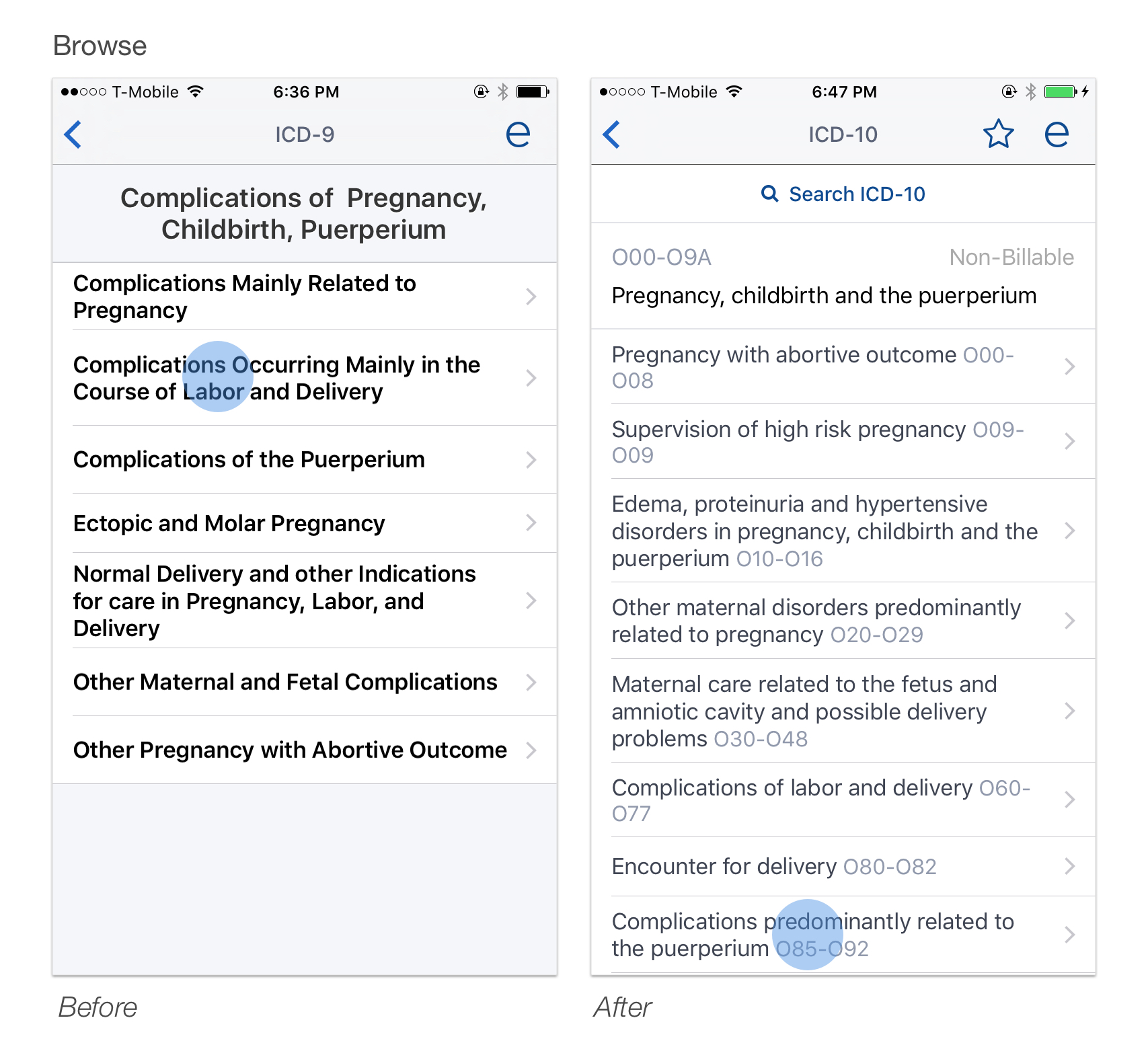
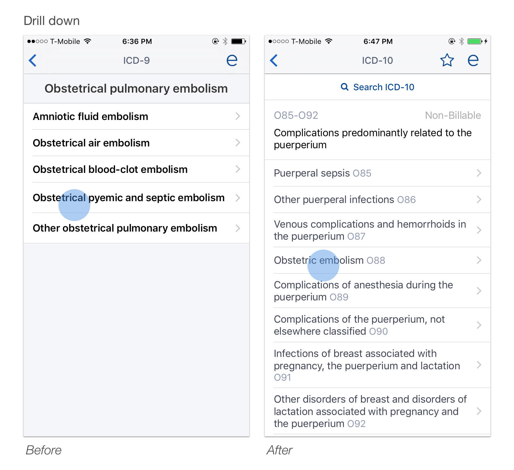
Titles emphasized over code numbers
Until a user gets down to a billable code, they need to compare and consider titles, not code numbers. In the previous version the codes had the highest hierarchy and were distracting.
SEARCH SEQUENCE
Search function added
Search allows user to jump right to any level within the decision tree, rather than forcing her to click through several levels in browse sequence.
Persistent search
Persistent search means a user can start a new lookup as soon as they find the info they need, even if they're 5 levels deep. In the previously constructed feature, a user would need to back out of their current browse navigation by hitting back several times before they could to lookup a different code.
Optimized search results order
Since I also worked on search, I knew our default search result algorithm wouldn't optimize the ICD-10 result experience, and with 10x as many codes as in ICD-9, we were worried a sub-optimal search result list would overwhelm users.
COMPARING LEGACY TOOL ICD-9
to NEW ICD-10 designs
REFLECTIONS
I really enjoyed working on this project. Though I would have loved to design the approach from scratch to really optimize the navigation and experience model to better match user needs and mental models, I think we made some great progress in improving the UX with a very short window of time and resources.
Working side-by-side in real-time with the developers in real-time felt like how this type of implementation project SHOULD work. We felt like a true team, drawing energy and ideas from each others' expertise, and the project moved smoothy and quickly.


